CYCLING CANADA
Canadian Championships Rebrand
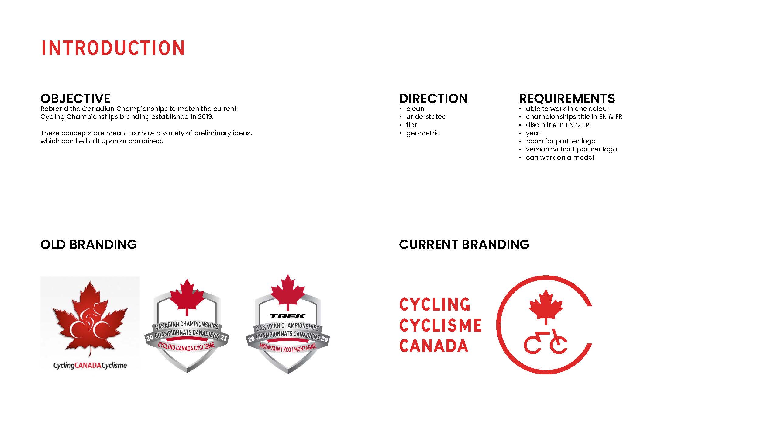
It was a big honour for IAM Creative Services to be entrusted by Cycling Canada to rebrand the Canadian Championships. Cycling Canada had undergone a rebranding in 2019, but until now had continued to use the old Canadian Championships logo. IAM Creative was brought on to redesign the logo to align with the current branding.
The project had several goals and challenges:
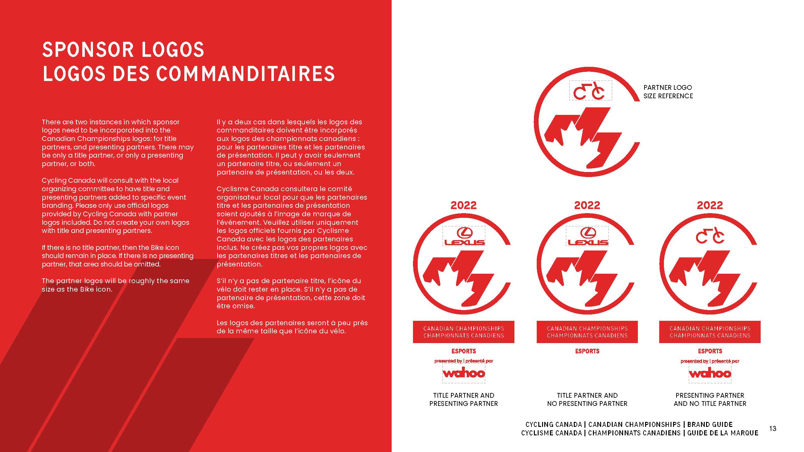
1) It had to be immediately recognizable in being associated with Cycling Canada
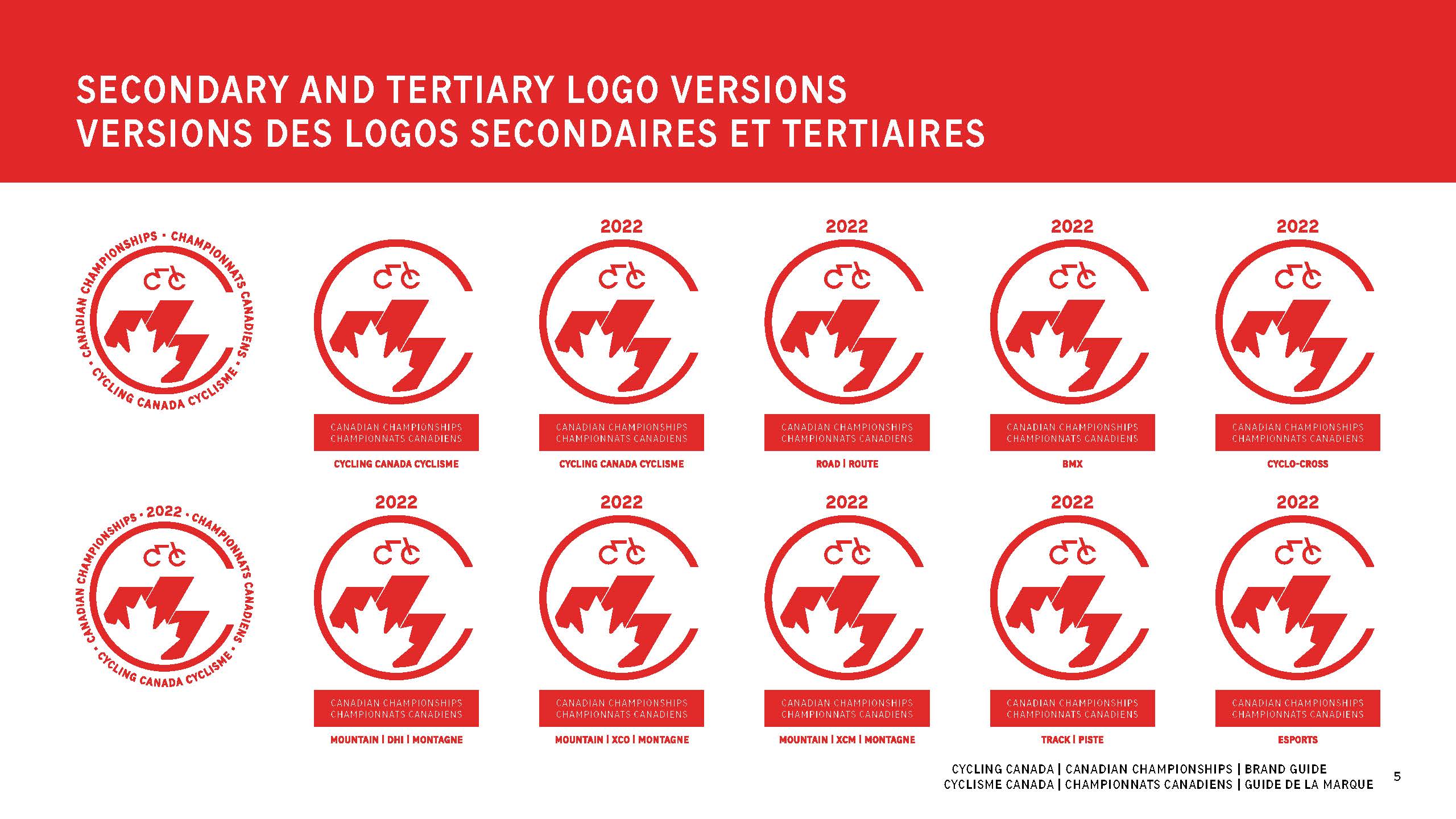
2) There had to different but consistent versions for all cycling disciplines
3) It had to be bilingual
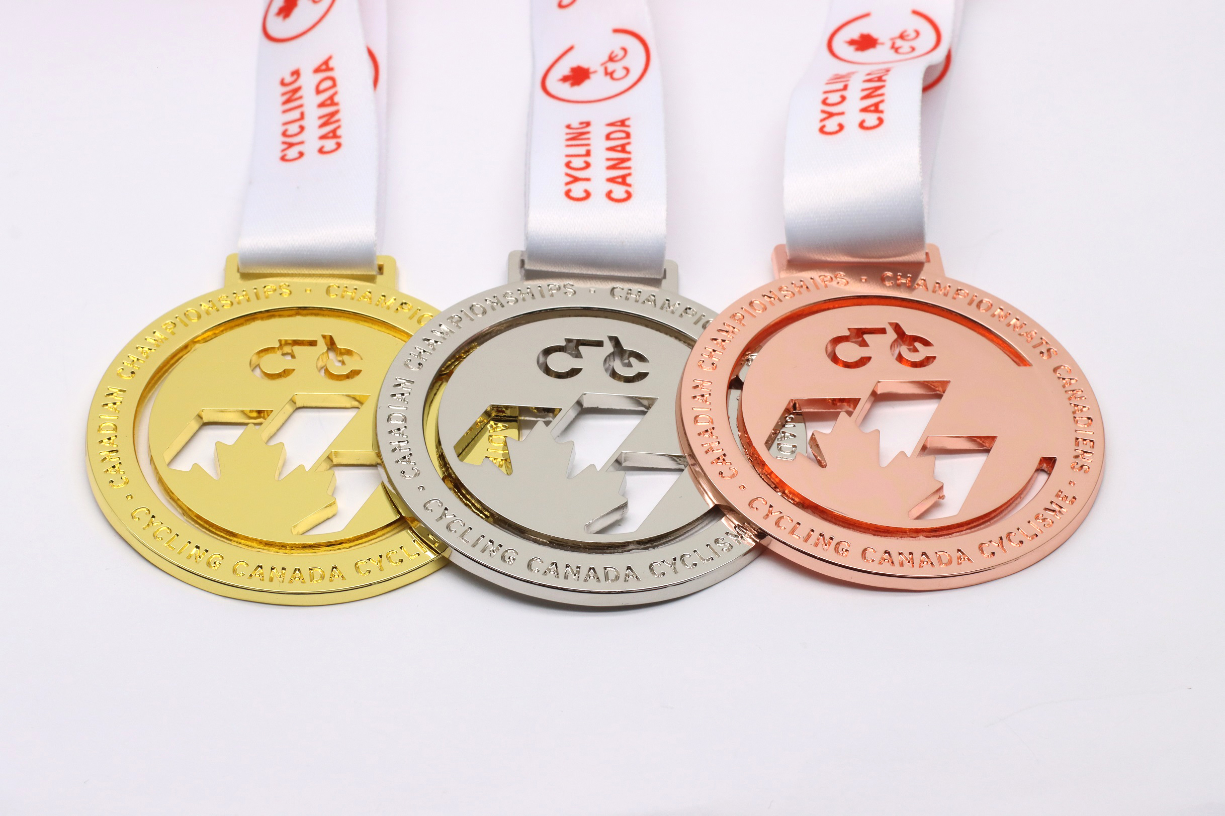
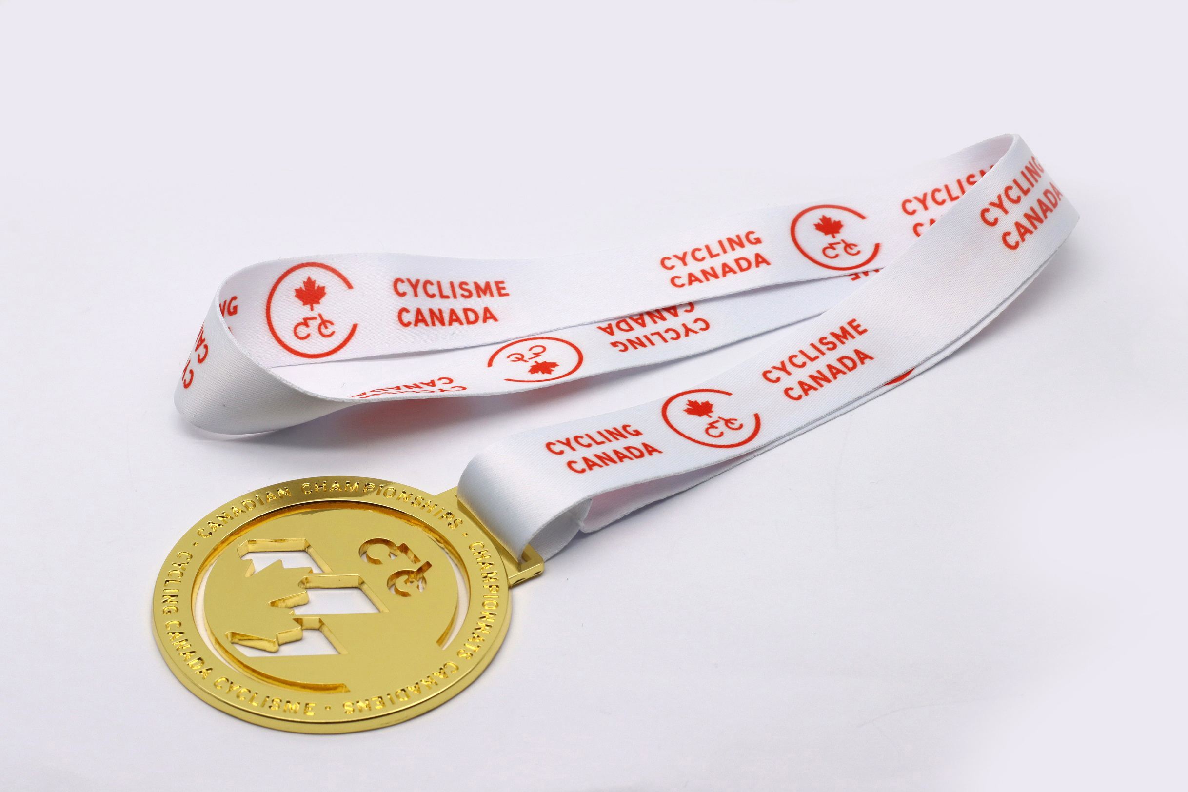
4) It had to be optimal for use online, in print, on signage, on clothing, and on medals
5) it had to be flexible to incorporate title and presenting sponsor logos
Shown here is the old Canadian Championships logo, alongside the 2019 rebranding of Cycling Canada. There was a big difference in these designs, so Cycling Canada wanted to rebrand the Championships to better align with their current branding.
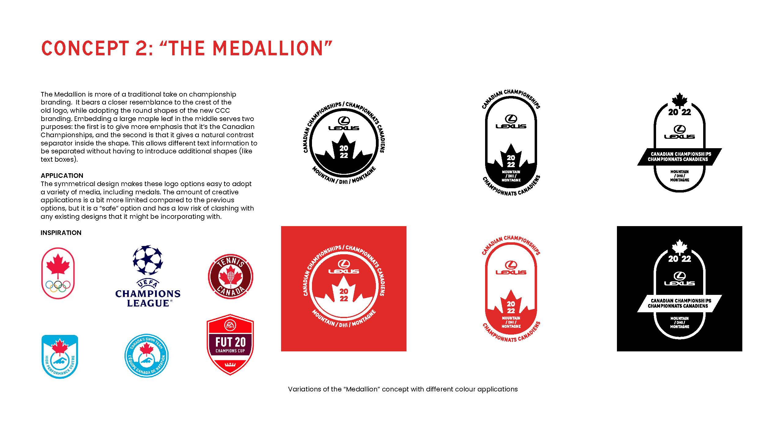
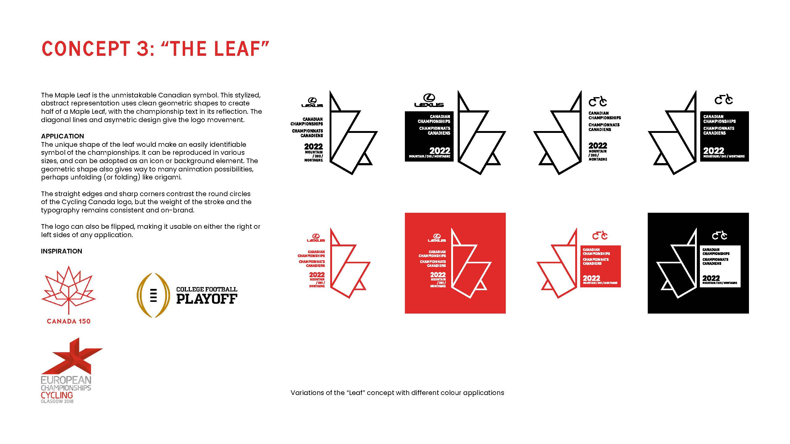
CONCEPTS
IAM Creative mocked up several different options for a new logo. We settled on three concepts to present to Cycling Canada.
CONCEPT PRESENTATION

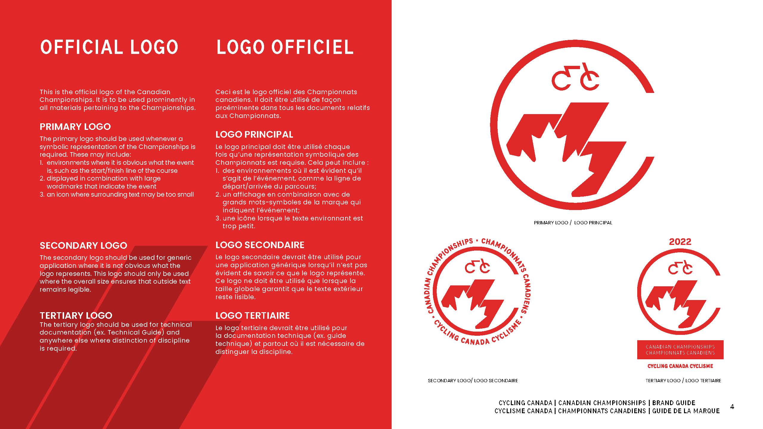
FINAL LOGO
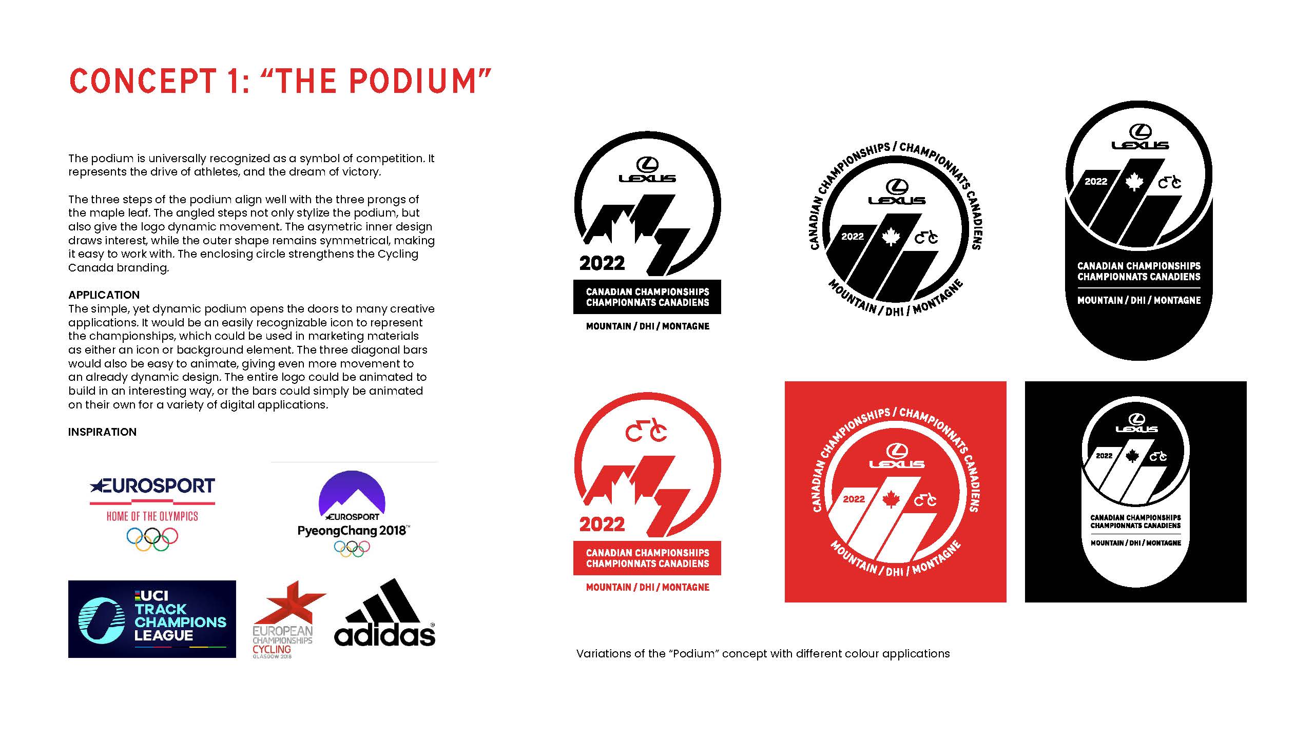
The “Podium” concept was eventually selected as the final logo. Working alongside Cycling Canada, we made some edits to further refine the logo to a state where they felt it best reflected the branding of their organization.
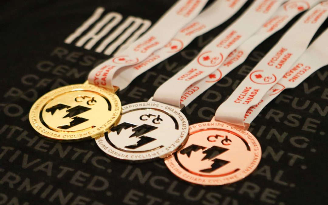
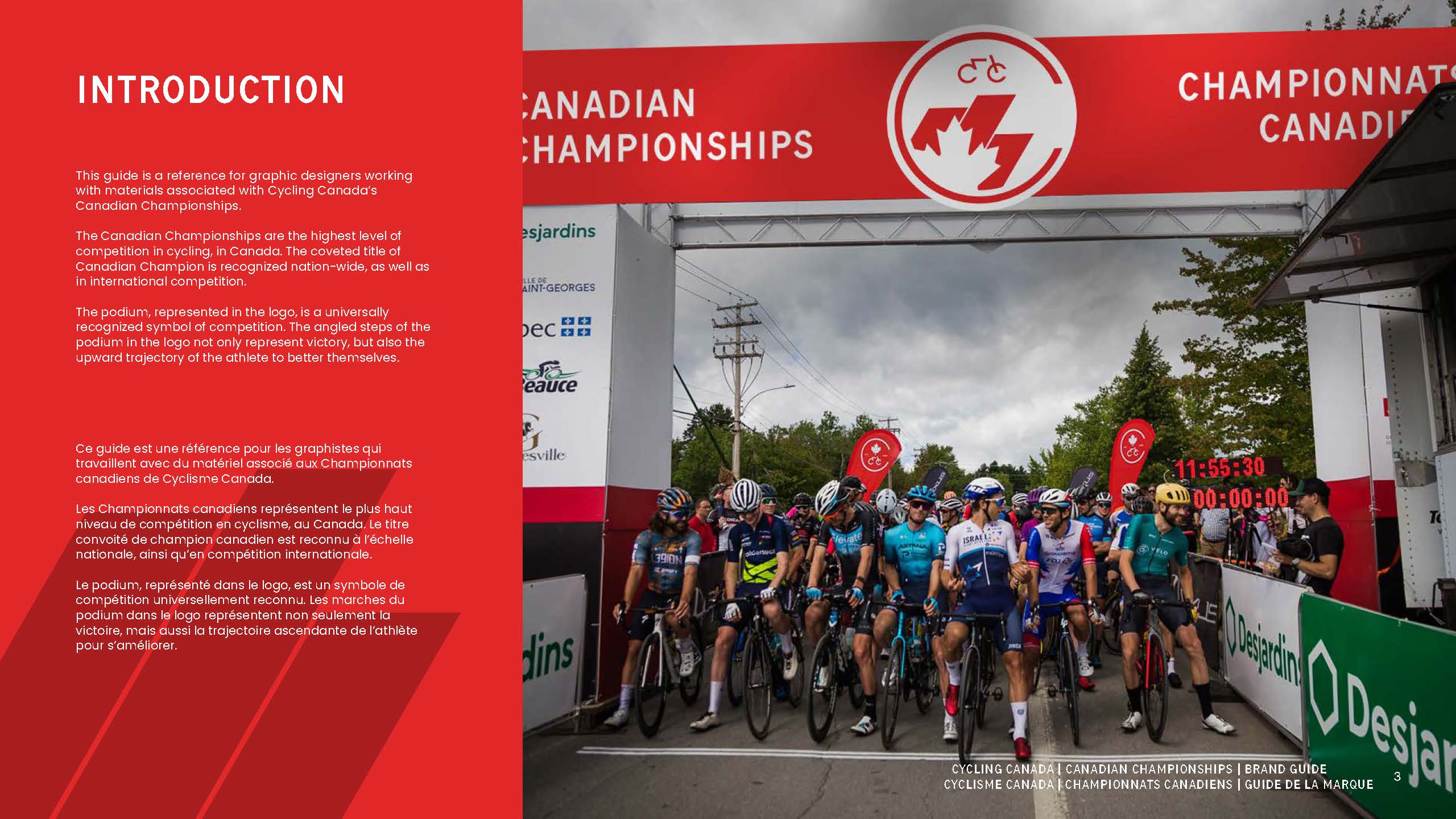
The Canadian Championships are the highest level of competition in cycling in Canada. The coveted title of Canadian Champion is recognized nation-wide, as well as in international competition.
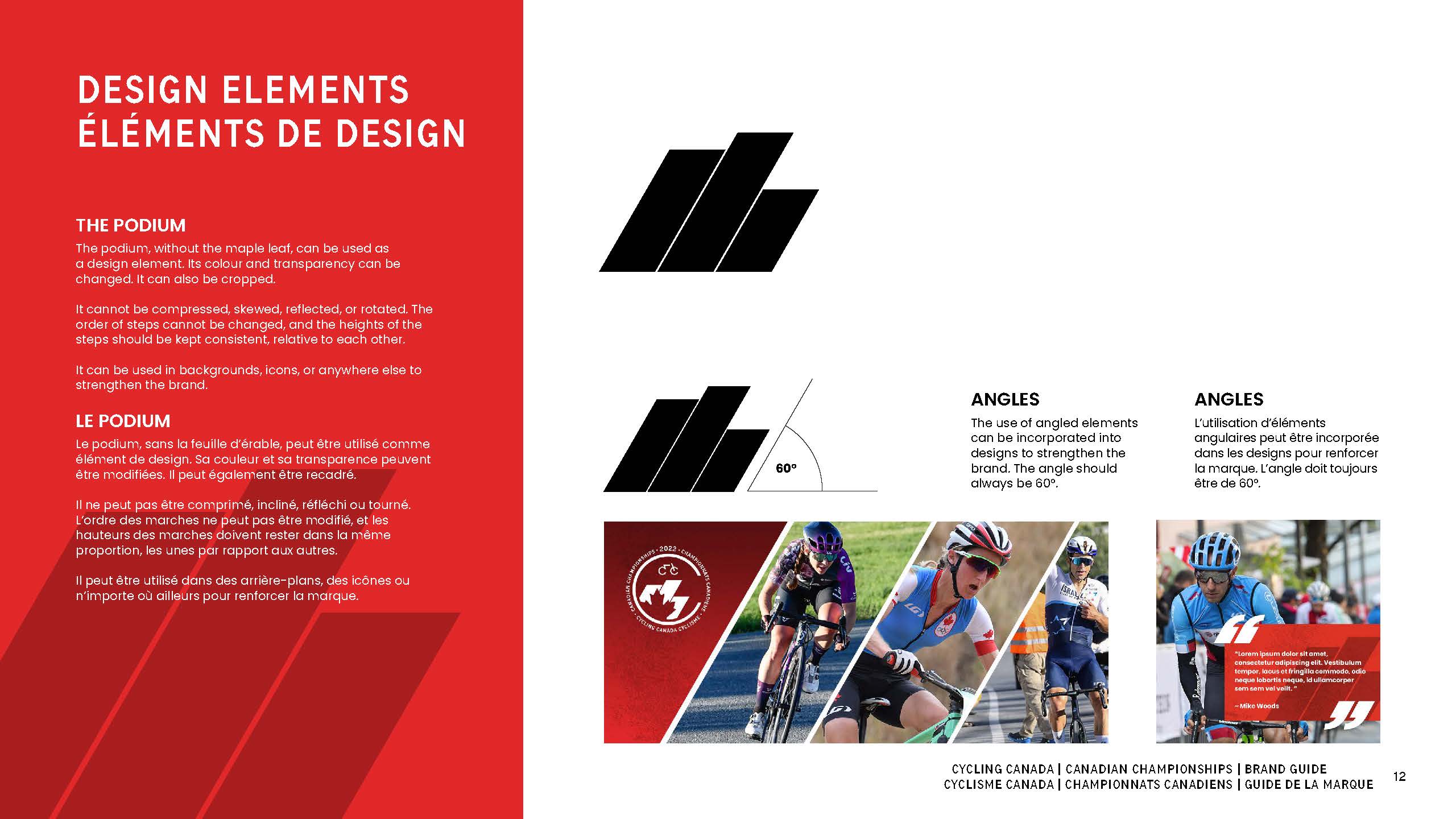
The podium, represented in the logo, is a universally recognized symbol of competition. The angled steps of the podium in the logo not only represent victory, but also the upward trajectory of the athlete to better themselves.
BRAND GUIDE
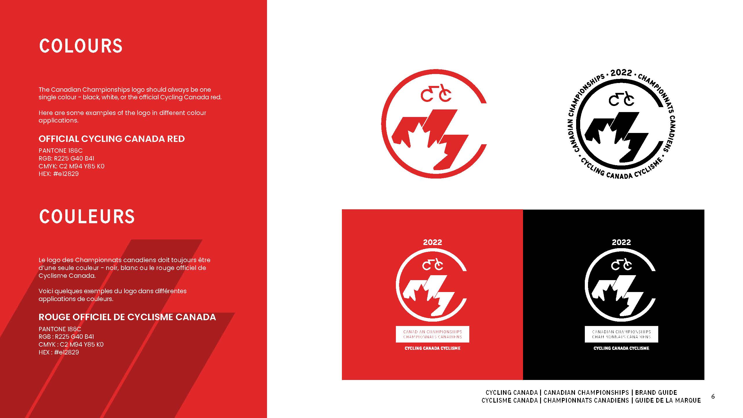
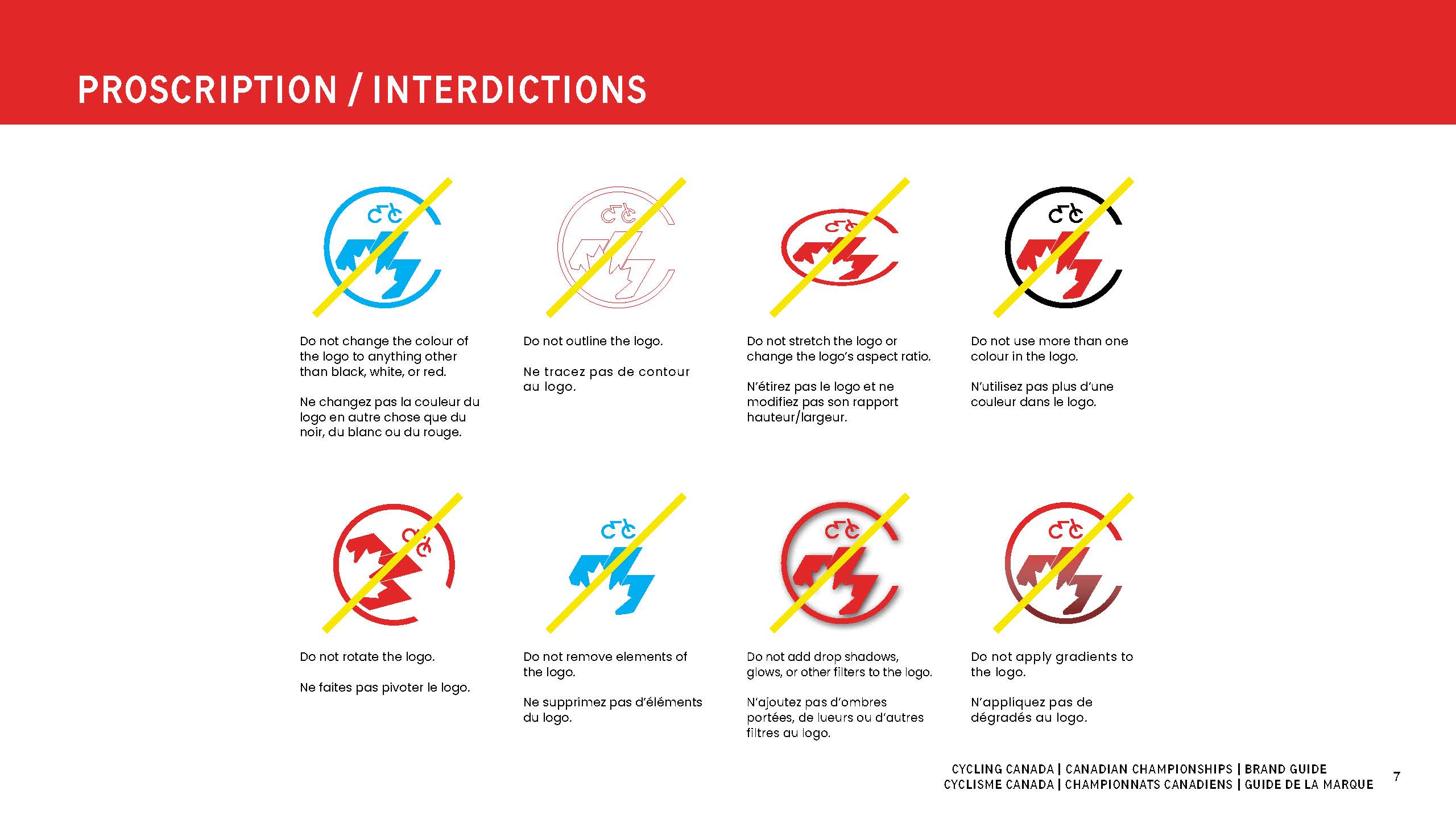
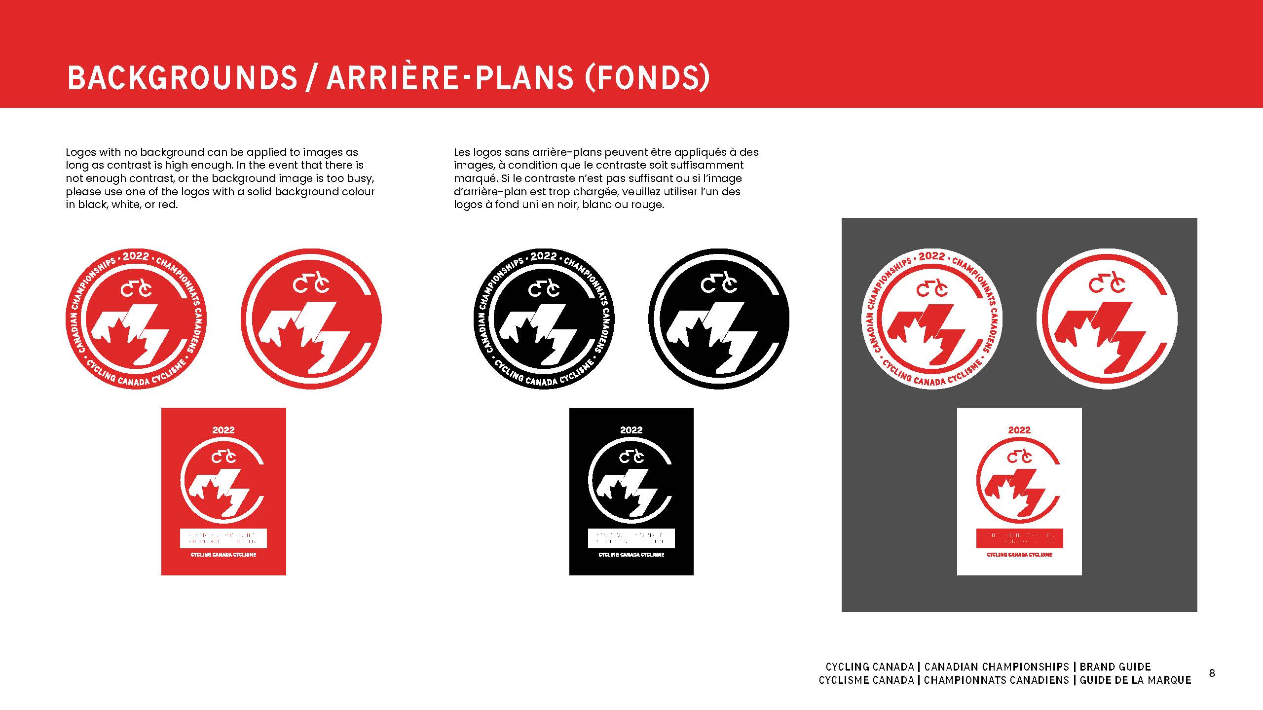
A brand guide was developed as a reference for all graphic designers working with the Canadian Championships property in the future. Specific rules regarding the use of the logo, official colours and typefaces, are all outlined in the guide. It is a way of ensuring that all work produced adheres to the branding that IAM Creative developed for Cycling Canada.
“We thoroughly enjoyed working with Mike on the refreshed design of our Canadian Championship branding. He was able to provide a product that met our very specific design requirements while maintaining a consistent look and feel with our overall organization branding. Throughout the process he was very engaged and most importantly took the time to listen to and understand our key objectives and present a final product which reflected that.”
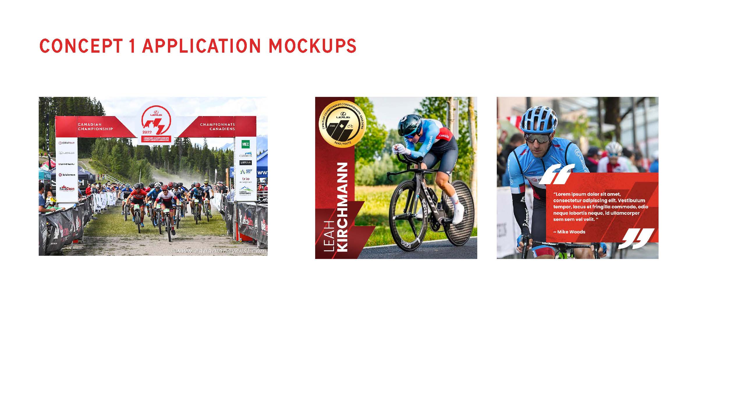
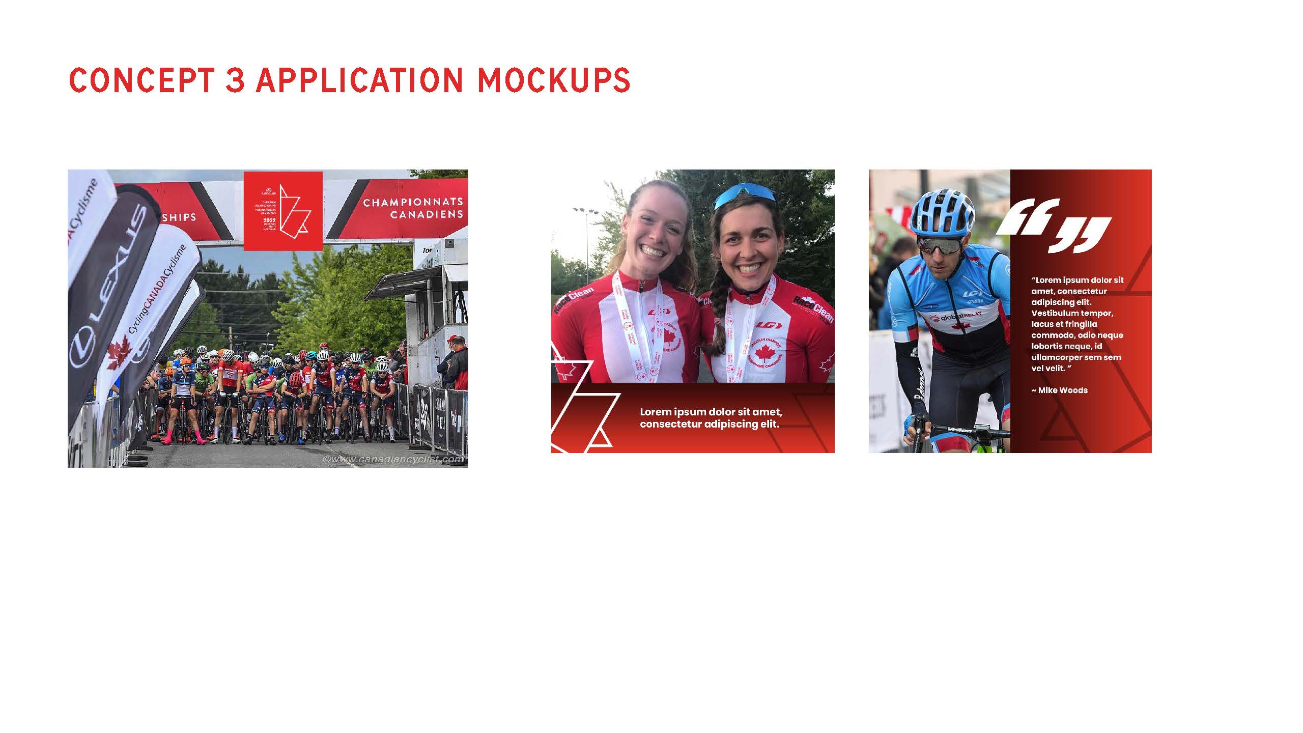
APPLICATIONS


Keep an eye out for the new Canadian Championships branding at all upcoming Championship events! For more information on IAM Creative Services, please contact Michael Chan at michael@inspireathlete.com
Recent Comments